CSS grid is an awesome piece of browser technology. The other side is that the concepts are not super intuitive and there is some work to be done before you can appreciate it. Endurance and passion is needed. Courage. Grit. Especially with those grid lines…
First you need at least a little bit of experience with css grid, because I will dive deep into it rather quickly. Let’s draw a picture.
Firefox has been a go to tool to visualize what is going on with css grid. Recently Chrome Dev tools added support too, and it can even show grid line names!
Suddenly you can see what is going on. There are six columns and six rows in this grid. There are lines around those columns and rows and some of them have name. These names can help with defining css properties—otherwise it can be very difficult to understand the code. I’m going to build the same picture with several approaches to show you the differencies.
Grid line numbers
Rows and columns are called tracks in css grid. Every track is bounded by lines. Therefore you can target specific locations in grid using line numbers. Grid area is a set of fields occupied by an element. You define the element’s area using grid-area property like this:
.item {
  grid-area: <start-row>/<start-column>/<end-row>/<end-column>;
}
The first approach is to use the line numbers. The auto keyword means default value. A negative number means some number of lines from the end.
<style>
  .grid-picture-one {
    display: grid;
    grid-template-rows: 1fr repeat(4, 30px) 1fr;
    grid-template-columns: 1fr repeat(4, 30px) 1fr;
    background-color: var(--base03);
    width: 300px;
    height: 300px;
  }

  .grid-picture-one .a {
    grid-area: 1 / 2 / 4 / auto;
    background-color: var(--yellow);
  }

  .grid-picture-one .b {
    grid-area: 2 / 3 / auto / 7;
    background-color: var(--blue);
  }

  .grid-picture-one .c {
    grid-area: 3 / 3 / -1 / auto;
    background-color: var(--red);
  }

  .grid-picture-one .d {
    grid-area: 3 / 1 / 3 / 3;
    background-color: var(--green);
  }
</style>

<div class="grid-picture-one">
  <div class="a"></div>
  <div class="b"></div>
  <div class="c"></div>
  <div class="d"></div>
</div>
      <style>
  .grid-picture-one {
    display: grid;
    grid-template-rows: 1fr repeat(4, 30px) 1fr;
    grid-template-columns: 1fr repeat(4, 30px) 1fr;
    background-color: var(--base03);
    width: 300px;
    height: 300px;
  }

  .grid-picture-one .a {
    grid-area: 1 / 2 / 4 / auto;
    background-color: var(--yellow);
  }

  .grid-picture-one .b {
    grid-area: 2 / 3 / auto / 7;
    background-color: var(--blue);
  }

  .grid-picture-one .c {
    grid-area: 3 / 3 / -1 / auto;
    background-color: var(--red);
  }

  .grid-picture-one .d {
    grid-area: 3 / 1 / 3 / 3;
    background-color: var(--green);
  }
</style>

<div class="grid-picture-one">
  <div class="a"></div>
  <div class="b"></div>
  <div class="c"></div>
  <div class="d"></div>
</div>
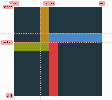
Grid line names
You can use line names instead of line number. Line names are those words in [square brackets]. Here is how I have build the initial example.
<style>
  .grid-picture-two {
    display: grid;
    grid-template-rows:
      [start] 1fr 30px
      [center] repeat(3, 30px) 1fr
      [end];
    grid-template-columns:
      [start] 1fr 30px
      [center] repeat(3, 30px) 1fr
      [end];
    background-color: var(--base03);
    width: 300px;
    height: 300px;
  }

  .grid-picture-two .a {
    grid-area: start / 2 / center / auto;
    background-color: var(--yellow);
  }

  .grid-picture-two .b {
    grid-area: 2 / center / auto / end;
    background-color: var(--blue);
  }

  .grid-picture-two .c {
    grid-area: center / center / end / auto;
    background-color: var(--red);
  }

  .grid-picture-two .d {
    grid-area: center / 1 / center / center;
    background-color: var(--green);
  }
</style>

<div class="grid-picture-two">
  <div class="a"></div>
  <div class="b"></div>
  <div class="c"></div>
  <div class="d"></div>
</div>
      <style>
  .grid-picture-two {
    display: grid;
    grid-template-rows:
      [start] 1fr 30px
      [center] repeat(3, 30px) 1fr
      [end];
    grid-template-columns:
      [start] 1fr 30px
      [center] repeat(3, 30px) 1fr
      [end];
    background-color: var(--base03);
    width: 300px;
    height: 300px;
  }

  .grid-picture-two .a {
    grid-area: start / 2 / center / auto;
    background-color: var(--yellow);
  }

  .grid-picture-two .b {
    grid-area: 2 / center / auto / end;
    background-color: var(--blue);
  }

  .grid-picture-two .c {
    grid-area: center / center / end / auto;
    background-color: var(--red);
  }

  .grid-picture-two .d {
    grid-area: center / 1 / center / center;
    background-color: var(--green);
  }
</style>

<div class="grid-picture-two">
  <div class="a"></div>
  <div class="b"></div>
  <div class="c"></div>
  <div class="d"></div>
</div>
Named grid areas
Another approach is to define the areas all at once using grid-template-areas property.
<style>
  .grid-picture-three {
    display: grid;
    grid-template-rows: 1fr repeat(4, 30px) 1fr;
    grid-template-columns: 1fr repeat(4, 30px) 1fr;
    grid-template-areas:
      '. a . . . .'
      '. a b b b b'
      'd d c . . .'
      '. . c . . .'
      '. . c . . .'
      '. . c . . .';
    background-color: var(--base03);
    width: 300px;
    height: 300px;
  }

  .grid-picture-three .a {
    grid-area: a;
    background-color: var(--yellow);
  }

  .grid-picture-three .b {
    grid-area: b;
    background-color: var(--blue);
  }

  .grid-picture-three .c {
    grid-area: c;
    background-color: var(--red);
  }

  .grid-picture-three .d {
    grid-area: d;
    background-color: var(--green);
  }
</style>

<div class="grid-picture-three">
  <div class="a"></div>
  <div class="b"></div>
  <div class="c"></div>
  <div class="d"></div>
</div>
      <style>
  .grid-picture-three {
    display: grid;
    grid-template-rows: 1fr repeat(4, 30px) 1fr;
    grid-template-columns: 1fr repeat(4, 30px) 1fr;
    grid-template-areas:
      '. a . . . .'
      '. a b b b b'
      'd d c . . .'
      '. . c . . .'
      '. . c . . .'
      '. . c . . .';
    background-color: var(--base03);
    width: 300px;
    height: 300px;
  }

  .grid-picture-three .a {
    grid-area: a;
    background-color: var(--yellow);
  }

  .grid-picture-three .b {
    grid-area: b;
    background-color: var(--blue);
  }

  .grid-picture-three .c {
    grid-area: c;
    background-color: var(--red);
  }

  .grid-picture-three .d {
    grid-area: d;
    background-color: var(--green);
  }
</style>

<div class="grid-picture-three">
  <div class="a"></div>
  <div class="b"></div>
  <div class="c"></div>
  <div class="d"></div>
</div>
Or you can do the same with special -start and -end grid line names suffixes. But in this case, it is a mess.
<style>
  .grid-picture-four {
    display: grid;
    grid-template-rows:
      [a-start] 1fr
      [b-start] 30px
      [a-end b-end c-start d-start] 30px
      [d-end] 30px
      30px
      1fr
      [c-end];
    grid-template-columns:
      [d-start] 1fr
      [a-start] 30px
      [a-end b-start c-start d-end] 30px
      [c-end] 30px
      30px
      1fr
      [b-end];
    background-color: var(--base03);
    width: 300px;
    height: 300px;
  }

  .grid-picture-four .a {
    grid-area: a;
    background-color: var(--yellow);
  }

  .grid-picture-four .b {
    grid-area: b;
    background-color: var(--blue);
  }

  .grid-picture-four .c {
    grid-area: c;
    background-color: var(--red);
  }

  .grid-picture-four .d {
    grid-area: d;
    background-color: var(--green);
  }
</style>

<div class="grid-picture-four">
  <div class="a"></div>
  <div class="b"></div>
  <div class="c"></div>
  <div class="d"></div>
</div>
      <style>
  .grid-picture-four {
    display: grid;
    grid-template-rows:
      [a-start] 1fr
      [b-start] 30px
      [a-end b-end c-start d-start] 30px
      [d-end] 30px
      30px
      1fr
      [c-end];
    grid-template-columns:
      [d-start] 1fr
      [a-start] 30px
      [a-end b-start c-start d-end] 30px
      [c-end] 30px
      30px
      1fr
      [b-end];
    background-color: var(--base03);
    width: 300px;
    height: 300px;
  }

  .grid-picture-four .a {
    grid-area: a;
    background-color: var(--yellow);
  }

  .grid-picture-four .b {
    grid-area: b;
    background-color: var(--blue);
  }

  .grid-picture-four .c {
    grid-area: c;
    background-color: var(--red);
  }

  .grid-picture-four .d {
    grid-area: d;
    background-color: var(--green);
  }
</style>

<div class="grid-picture-four">
  <div class="a"></div>
  <div class="b"></div>
  <div class="c"></div>
  <div class="d"></div>
</div>
Conclusions
- grid areas are only shortcuts for a set of grid lines that bound the area
grid-template-areasmight be the most readable approach for placing elements on specific areas in grid- for more dynamic or bigger grids it might be useful to use line numbers or named lines but the readability goes away rather quickly